Most actual fonts of 2021
This year is soon coming to an end, and by all means it has brought us many ways to develop Modern Design further. We closely looked into the typography of this year…and picked the best patterns!
Here comes the list of 2021 Typography Trends: pick suitable fonts.
Geometric Sans Fonts
Influenced by Bauhaus designers in the early 20th century, geometric sans serifs are readable, reliable fonts that provide a balanced impact to your design. In this unstable year, many businesses and companies use them in hope of giving their clients (and potential clients) the feeling of safety and reassurance.
From a design perspective, expect more emphasis on readability and clarity in these font styles, with solid weightings remaining popular as brands look to make readable statements.
Eloquia fonts

Versatile and functional: Eloquia is a neo-grotesque sans serif type family with geometric roots. Smooth and elegant edges, same time it gives sharp, powerful feelings and is perfect for various activities, invitations, travel theme or app development, product design, school-oriented products and many more. It doesn’t feel cold in comparison to other neo-grotesque groups of fonts.
Eloquia supports more than 88+ languages including all major Latin languages. With 34 fonts in total, Eloquia comes in two distinct optical sizes Text and Display, which are press and clean. Consists many powerful OpenType features, including Superscripts, Oldstyle Figures, Case Sensitive Forms and many more. It’s a typeface with the unmistakable influence of geometric shapes which radiates warmth and is made as naturally as other sans serifs.
Facundo

Created by Daniel Hernández and Paula Nazal, published by Latinotype, this is a new font to be on top the next year, just like this one. Friendly, familiar but fresh – it’s easy to add your design renewed look when it comes to Facundo – whether you use it for brand identity or corporate needs, web design or any type of logo. Simple geometric shapes, uppercase glyphs, the font comes in 7 weights plus matching italics.
Facundo contains a set of 715 characters that support over 200 languages that use both Cyrillic and Latin scripts.
Magazine Grotesque
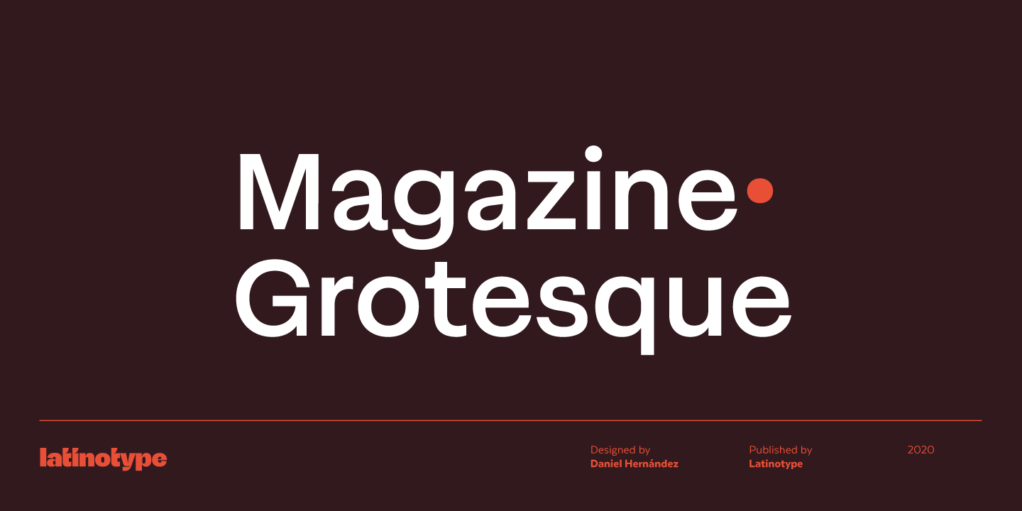
Magazine Grotesque is a sans-serif font specially designed for headlines and titles, logotypes or short blocks of text. Easy to read on any device, balanced and well-weighted, it leaves an impression of confidence and comfort. The unusual rhythm of it’s outstroke, just like other features of this font, makes it different from the traditional Grotesk typefaces.
Coming from Latinotype, Magazine Grotesque has a standard set of 487 characters and supports over 200 Latin-based languages. Trendy, detailed and balanced. What else could we ask for?
Soyuz Grotesk
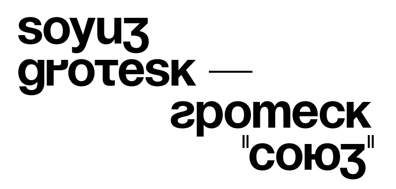
The group of enthusiasts from The Temporary State came together and created Soyuz Grotesk – a digitized version of first cyrillic version of Helvetica, designed by Yuri Kurbatov and Maxim Zhukov, two students back in 1963. It gives a radiating feeling of achievements, future and better tomorrow under the motto of “The New New Typography”. Initially a bootleg of a font, a collection of letter ‘cards’ on transparent plastic for manual photocomposition, it gained a fame in the shortest time once, and now has it’s a well-deserved place in any designer’s font collection with an added set of signs, symbols and other characters. Which is true: it’s used by any societies and brands, matching anything. You can save it anywhere for free!
P.S. Did you know that Helvetica was one of Massimo Vignelli’s favourite fonts?
Founders Grotesk
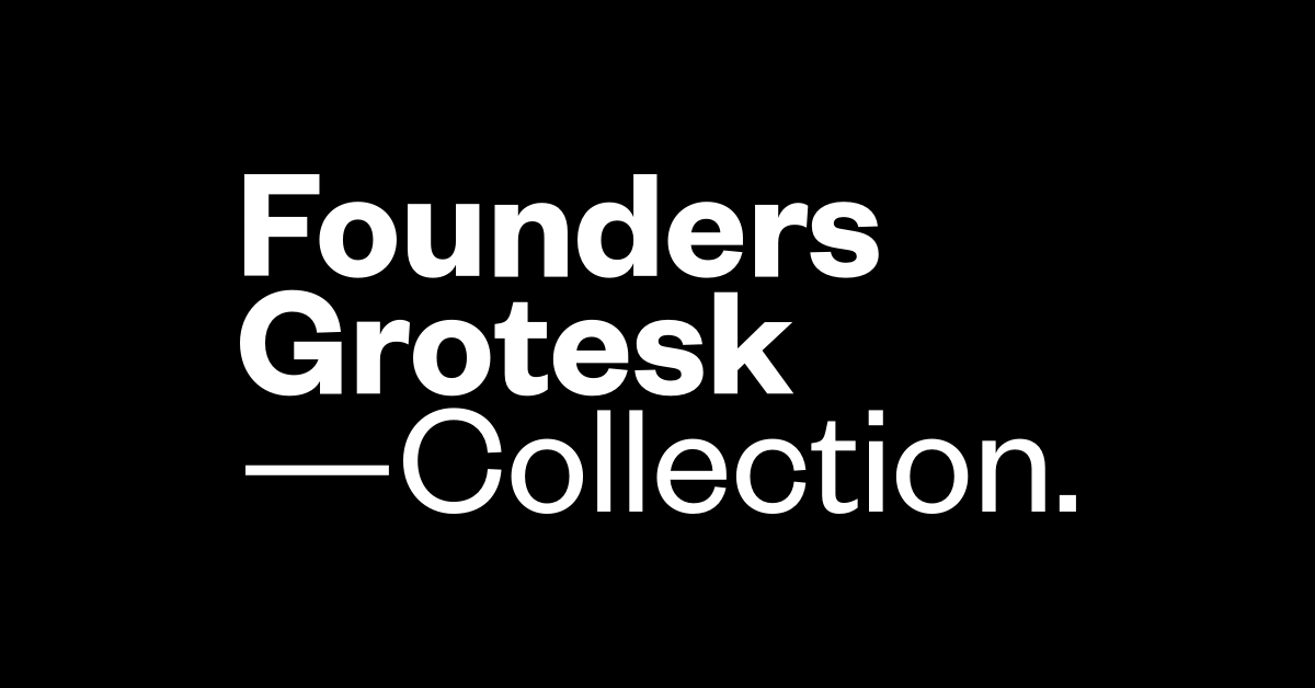
New Zeland based Klim Type Foundry has published a typeface, designed by Kris Sowersby, influenced by 20-th century Grotesque series and taking it’s place in the top 40 adobe fonts. Geometry, curves and forms: these details are coupled with tight spacing strategies from Helvetica’s Halbfett headline-sized metal cuts from the late 1950s and other styles of this era. Comes in 10 styles, has smart accents, symbols and ligatures, supported with 200 languages. Founders Grotesk is not intended as a strict revival, it resolves the best details from the last century into a large family designed for modern typography. Suits perfectly for large headlines or medium text blocks on web or magazines, has a strong and confident meaning, though a bit harder to read on bigger text blocks.
Expressive Sans Serifs
Like their geometric counterparts, expressive sans serif fonts rely on bold, structured shapes for clear communication, but with that little bit extra. These sans serif fonts will offer brands a way to express the pent-up energies of last year while keeping things grounded in something solid and reliable. Carefully tailored, they will add an accent to any design with amazing success.
Gosha Sans
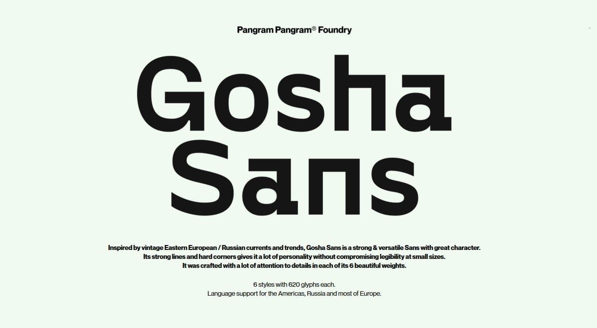
Crafted with great attention to details and inspired by vintage Eastern European trends, is one of the favorites these years. Makes you curious, catchy, with strong lines and hard corners – very easy to remember and perfect in use as accent font. Gosha Sans has 8 styles with 475 glyphs each including Cyrillic support with interesting shapes; this font has some tension, unusual angles. Perfectly will suit for posters, big headlines with accent on Typography, smartly fashionable brands or signature.
Would you use it in your design?
Bauziet
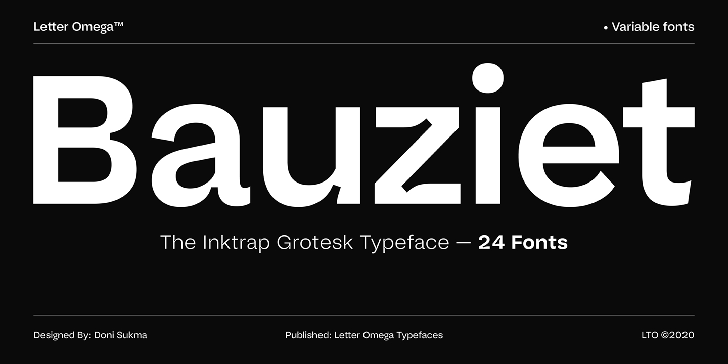
Geometrical standards? Better. With 110+ (latin based) languages support, Bauziet Typeface inspired from industrial and modernism graphic design approach with geometric shapes and dynamic calligraphic curve. Designed by Doni Sukma, it has unique Ink traps with the emergence of variable font technology.
Another interesting detail with a neutral and architectural approach, To set alternate Character .ss01 in letters like f t j y, by adding sliced out elements to flat to be horizontal strokes, lowercase square tittle “i”, squares marks, period, comma and single-story lowercase “g”. Bauziet font family consists of 24 fonts in total. Both families consist of 6 weights plus italic and support a large number of OpenType features you may need.
Expect to add accent in your design with these smooth and sharp transitions.
Neue Machina
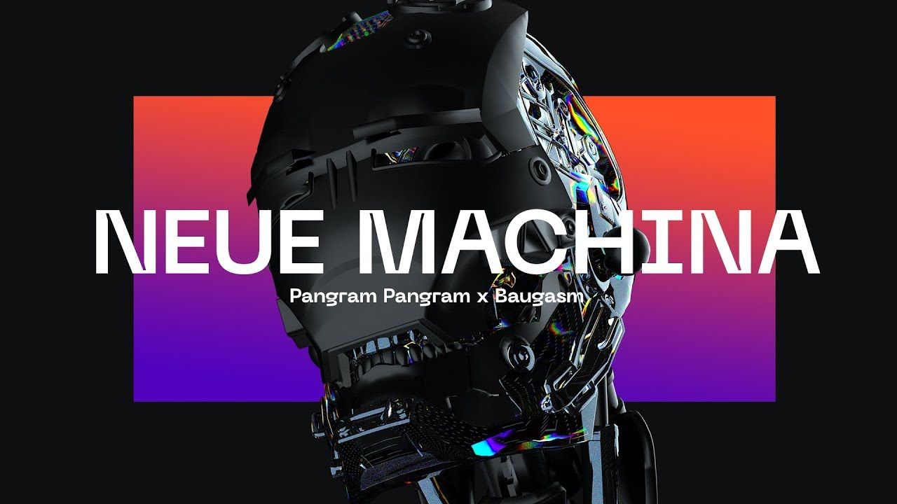
Designed by Mathieu Desjardins and known for it’s rounded corners, deep ink traps in heavier weight, Neue Machina is a powerful typeface highlighting both monospace and geometric type features. Notice it’s details, texture of noise in figures and futuristic vibe!
Has 7 impressive and eye-cathing styles, it is inspired by the aesthetics of robotics and machines, a font suited for the future of technology. You won’t mistake it’s Cyrillic symbols to any other font. It was designed to be versatile, to blend in your designs in its lighter weights or to give them a lot of personality in its heavier ones. Use it in posters, big headlines, development theme or any other – it will work for anything.
Fractul
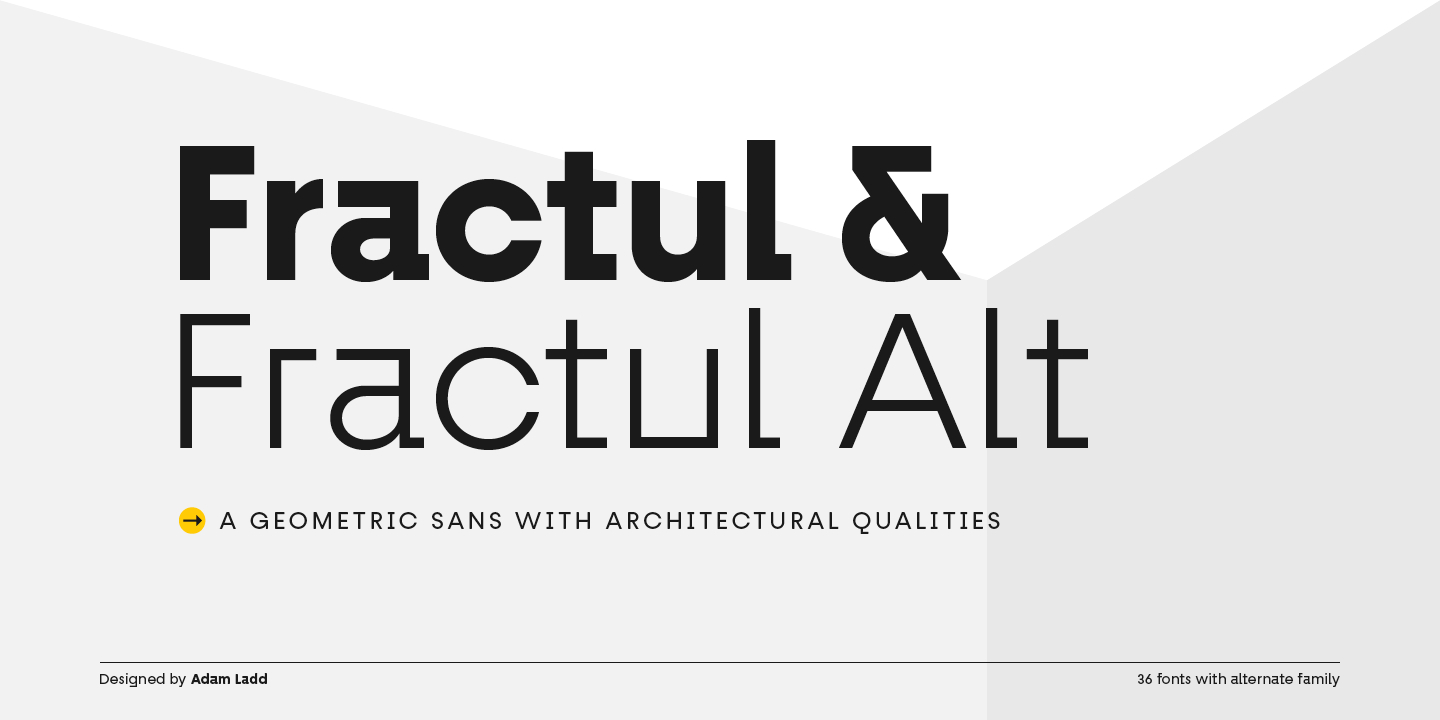
Fractul is a well-designed font and got strongly showing geometrical qualities. Has classical proportions and built from the Konnect family – this alternate type family which furthers the angular design. With this family employed, this font gets modern, classical, and playful characteristics. With it’s simple, clean forms and classically inspired proportions this font is easy to remember.
You’ll see this most evidenced in characters like a, f, g, t, y, etc. where certain strokes have been straightened for an angular and modern appearance; also included is Fractul Alt. Fractul also has many humanistic OpenType features. Multiple stylistic alternates (6 stylistic sets) – Standard and discretionary ligatures – Case-sensitive punctuation for All Caps – Fractions, numerators, denominators – Superscript, subscript – Slashed zero With over 600 glyphs, this font has extensive.
Latin language support (100+ Latin languages) for Western, Central, and South Eastern European.
Halenoir fonts
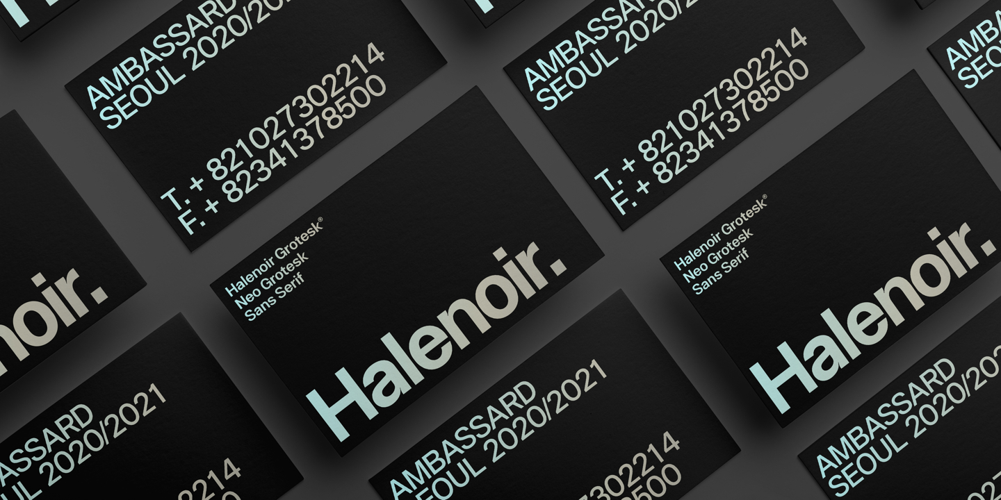
At our glance, most laconic font of expressive sans serifs.
Inside you’ll find 10 weights, 102 fonts, 3 distinct optical sizes, 801+ glyphs and many more. Halenoir is designed to be suitable for mobile, graphic, and editorial or web. But that’s just a part of it’s destination. Three distinct optical sizes: Display and Text. The larger Display versions are drawn to show off the subtlety of Halenoir and spaced with headlines in mind, while the Text sizes focus on legibility, using robust strokes and comfortably loose spaces. In the typeface, each weight includes extended language support, fractions, tabular figures, arrows, ligatures and more.
Perfectly suited for graphic design and any display use. It could easily work for branding, web, signage, corporate as well as for editorial design, mobile interface. It also contains many interesting elements like brand symbols, line and solid circled glyphs, tabular figures, graphic patterns and many more.
Character Serifs
Serifs amazing for magazines, clearly suitable in content of design and architecture, these typefaces are increasingly sophisticated and refined. With designers hugely creating display-ready serifs, brands and startups are returning to these more sophisticated font styles. Easy to read and abstract, they will always be actual to many designers.
Bad Russian
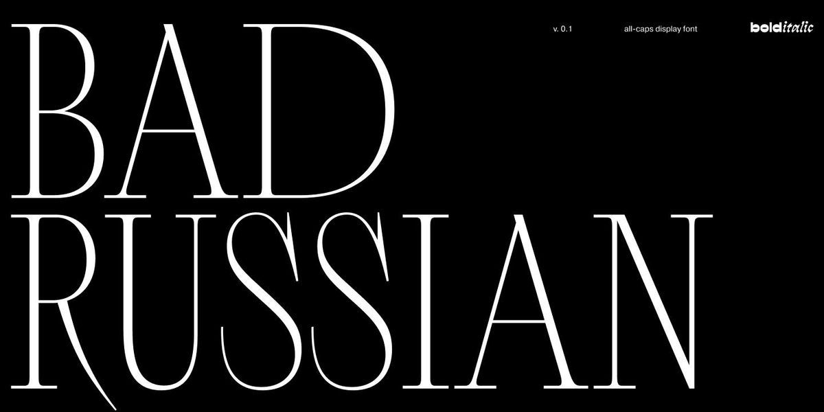
Bad Russian is an antique all-caps serif typeface that has incorporated the strangest Soviet-type cover details of the 1930s. The proportional characters of the typeface have preserved the echoes of the past. Created by Maria Kasatkina, the font looks amazingly actual, coming through historical features, manifested in details: triangular shapes of Л and Д, peculiar serifs of C, G, S and З, flame-shaped elements, a loop of the У, closed letterforms with elongated serifs. A contemporary approach to these details makes the typeface relevant and expressive.
Bad Russian fits well for any kind of display typography, web, product design, fashion or signature.
Agne

Agne is a versatile, modern and elegant serif font. Designed by Reza Rasenda & Riska Candra Dewi, It has a unique style with stylistic, alternates, ligatures and supports multilingual languages.
By having massive contrast between stems, it brings same time modern and elegant features. Not yet widely spread, it can be very personal to your design, with a strong set of 329 glyphs, memorizable symbols. Our advice as a perfect suit as an accent font.
Juana
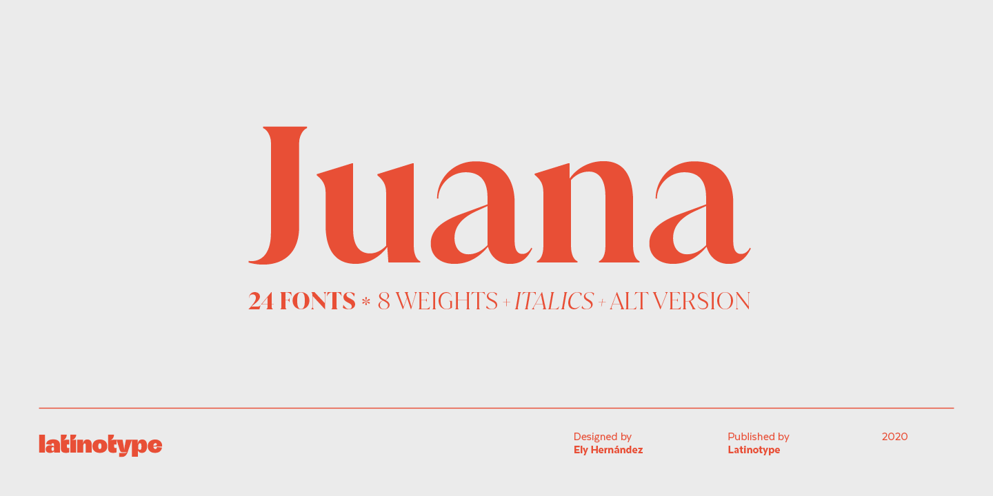
Designed by Ely Hernandez for Latinotype, Juana is a perfect example of the new-retro trend that’s spreading throughout the design world right now. Lively, robust serif, based on Jazmin typeface with a broad visual range, giving us the vibe of a 1970s Santiago newsroom. This font features a more developed design while still maintaining the essence of the original version. The extreme contrast between thick and thin strokes gives Juana a harmonic and stylish look.
It comes in 8 weights with matching italics and includes an alternate version. Find 309 glyphs inside. The whole character set supports over 200 Latin-based languages. Juana is for headings, titles, logos, magazine headers, branding and many more.
Valky
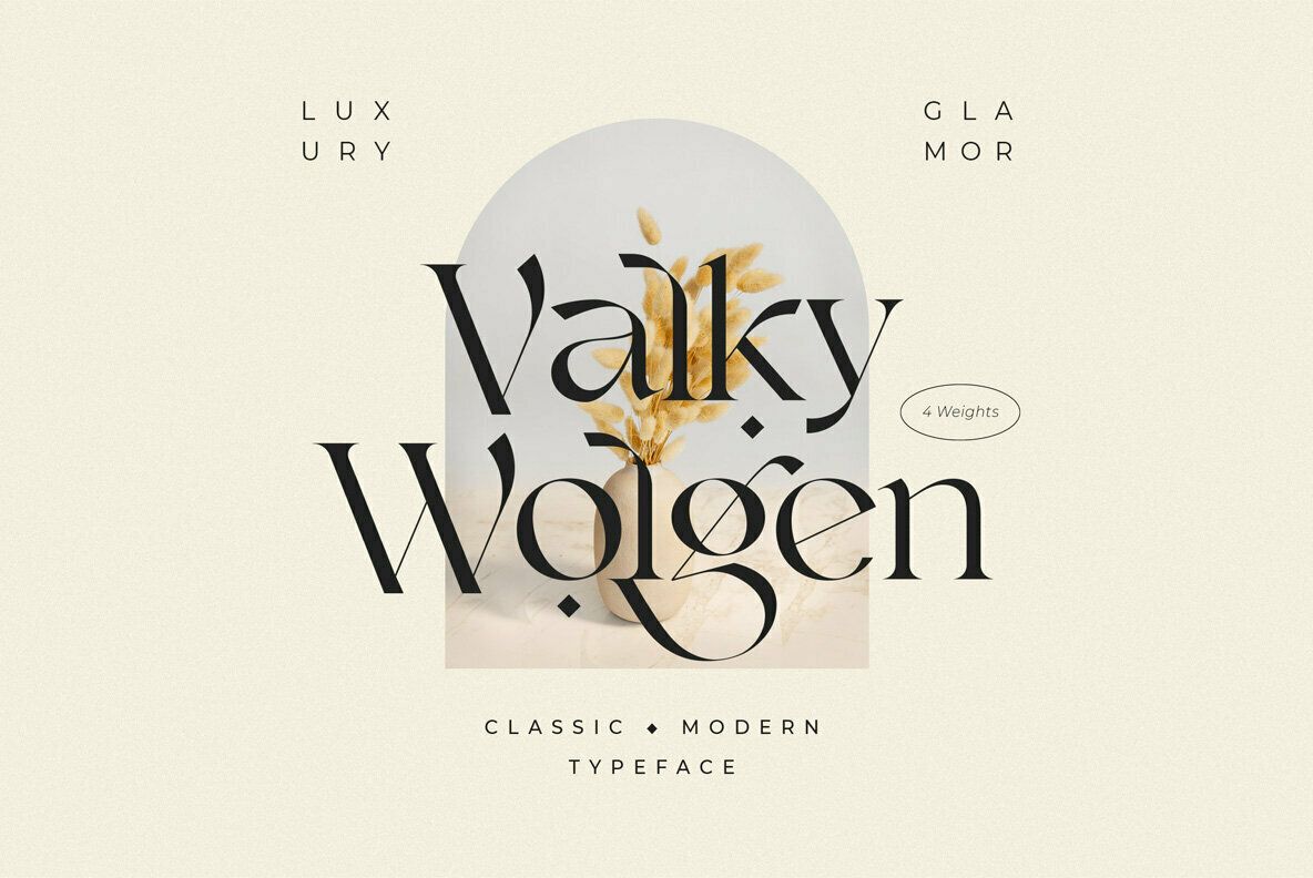
Valky has very accented characters and is a fancy vintage-like serif typeface with beautiful ligatures, tons of special alternative glyphs, ornament and ravishing style. It’s a very versatile font that comes in use with product packaging, closing branding, logo design, blog or invitations. Stylistic alternates & ligatures make this font very versatile which works great in large and small sizes. It features 4 weights, multiple language support, numerals and punctuation, unmistakable glyphs.
ED Lungwort
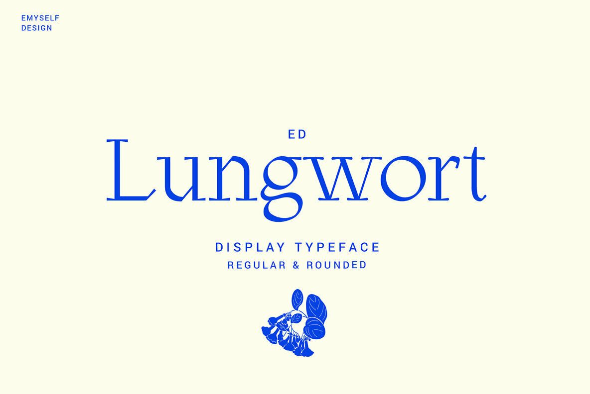
Lungwort is the most posteric of all character serifs. ED Lungwort is a modern elegant and classy display font, this font has 2 styles: regular and rounded. This font is inspired by the classic and modern serif, humanistic and handwritten.
This font is equipped with various features such as uppercase, lowercase, punctuation, symbol, multi-language support, and ligature. This font is suitable for branding, logos, decorating theme, UI, apparel, posters, magazines, etc.
Thank you for reading!
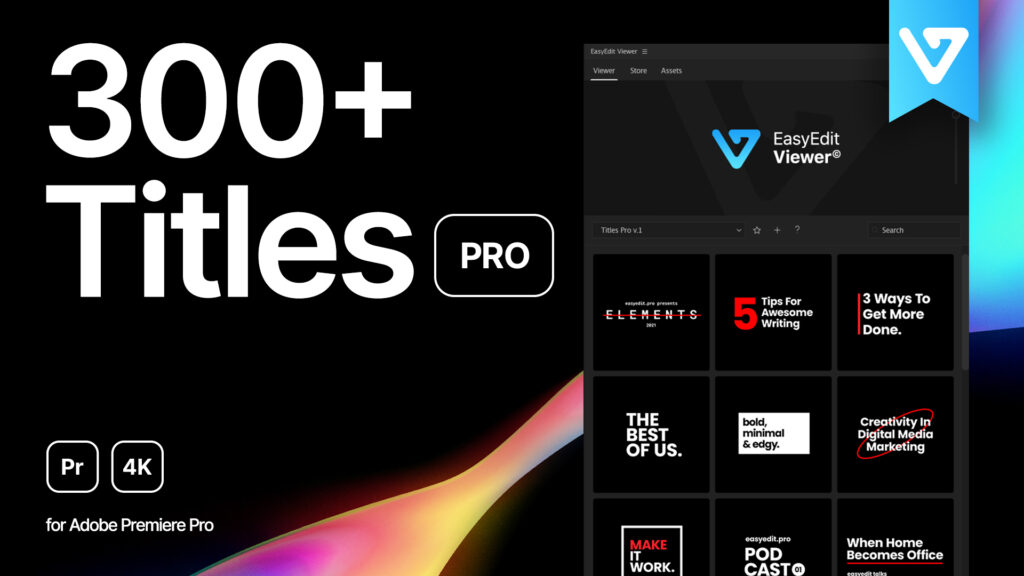
This list can help you with your choice of perfect and actual fonts for your design. Some may be trendy, some are definitely gonna be timeless, but all of them – are the well-deserved hits of 2021. Make sure the font you’re choosing represents your design, it should stand for your brand’s identity and be understood by your audience. If you need to add a great font pack to your collection and straight into your project – we advise you using Titles Pro for it. It has differently crafted styles for any design, from minimal lines and lower thirds to callouts and sale banners. It makes your choice easier and work process faster, since you have 1400+ templates to use. Try it out!
References and external links for downloading:
https://latinotype.com/display-weights?font=254https://latinotype.com/display-weights?font=240https://typefaces.temporarystate.net/preview/SoyuzGrotesk
Eloquia Font | Webfont & Desktop | MyFonts
https://pangrampangram.com/products/gosha-sans
https://www.myfonts.com/fonts/letter-omega/bauziet?tab=techSpecshttps://pangrampangram.com/products/neue-machina
https://www.fonts.com/font/adam-ladd/fractulhttps://www.myfonts.com/fonts/ckhans-fonts/halenoir/?lastItem=200&tab=individualStyles
https://www.paratype.com/fonts/mk/bad-russian
https://www.youworkforthem.com/font/T13691/agne
https://latinotype.com/display-weights?font=263https://www.youworkforthem.com/font/T13143/valky
https://www.youworkforthem.com/font/T12659/ed-lungwort